Streamlining Search for Quicker Results
Self-initiated project. Bringing users closer and faster to their desired workout studios.
Role:
UX Designer
UI Designer
Timeline:
Nov - Dec 2023
Team:
Me, Myself & I☺
Skills:
User Research
Interaction Design
UX Design
Visual Design
Storytelling
Tools:
Figma
Whimsical
Adobe Creative Suite
/01 Project Overview
ClassPass is the largest health club aggregator, bringing thousands of fitness classes, gyms, wellness and beauty venues within one app. With its subscription-based service, members gain access to these diverse studios.
Let's start by analyzing the use case that ClassPass is trying to solve...
ClassPass aims to help users explore and experience different studios without the commitment to a single one.
Their mission statement is: "Motivate people to live inspired lives every day by introducing and seamlessly connecting them to soul-nurturing experiences.”
ClassPass does a good job of curating a wide range of participating studios for users. However, are they "seamlessly connecting" users to these studios?
I’m afraid not. The current process of finding and booking a class involves too many steps, which can be frustrating and hinders the user's ability to receive accurate results. Therefore, users may not be able to easily connect from point A to point B.
So I asked myself...
/02 Problem Statement
How can I improve the Class Pass app to help users consistently discover more accurate and relevant results?
Research
/03 User Surveys
I investigated what ClassPass users felt about their current experience searching and booking for new classes. To gather insights, I distributed a survey through social media and received responses from 10 individuals actively using ClassPass.
Here are the 3 main pain points users struggle with from my research:
Too many steps to get desired results
A significant 90% of users express frustration with the current search process, requiring too many
back-and-forth steps to get their desired results.
Inaccurate location-based search results
78% of surveyed participants consider location as the most crucial factor when deciding to book a studio, however the results presented in search aren't always accurate.
Ineffective filters and sorting options
Over 60% of users find that the available filters and sorting options on the app do not effectively refine their search.
/04 Search Flow
Let's take a look at the current search flow and the opportunities for improvement.

Current
Currently, users don't have access to a map view right when they arrive on the search tab.

Redesign
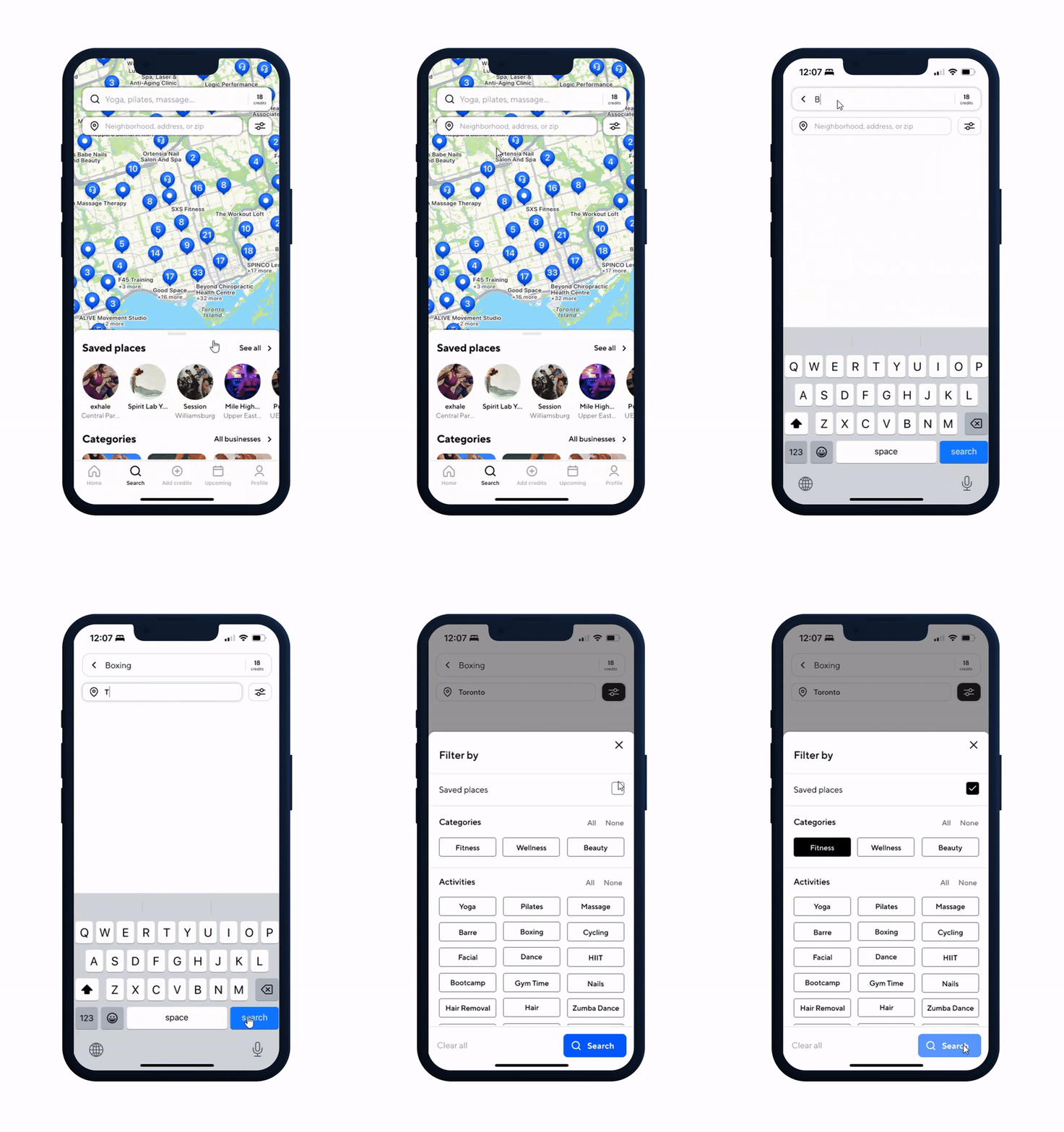
Adding a map view, location field, and filters button upon landing on the search tab will streamline the user's search.

Current
The current search results limit users to only see studios that are available on specific days.

Current
Information is all cluttered together.

Current
The ‘Sort results by’ list is simple, but the copy is not specific enough for the user to grasp.

Current
60% of users said they were dissatisfied with the filters, as it didn’t help refine their search.

Redesign
Adding an ‘All’ studios tab provides users with a comprehensive overview of all available studios in their area.

Redesign
Slight clean-up of design.

Redesign
Consistent and clear messaging provides users with a clear understanding of the sorting functionality.

Redesign
Incorporated additional filters to help users narrow down their search faster.

User Testing Feedback
Before finalizing the final prototype, I presented the new design to three regular users of the app. I incorporated their feedback by making necessary adjustments to the design. Here is some of the feedback they provided me:
I like it! I like the activity/services callouts on the filters and how more information is provided. The overall appearance is sleek and greatly improved! It would be helpful if the activity name was listed in alphabetical order.
It looks so good! It is so much more intuitive. It is easier to have the filter and the location under
the search bar, this is what I
would want.
Participant 2
I definitely prefer this more. The filters help me narrow down my search more. I love the fact I can filter for specific rating now.
Participant 3
Participant 1
Final Recommendations (Prototype)
1. Refined Search Process
Incorporated the map view, location field, and filters button directly onto the search screen to streamline the search process.

2. Updated Filters
